10 Indian author websites worth checking out
May 13, 2015 0 By Pramathesh BorkotokyIn today’s world, every writer needs a website – there are so many good reasons for having one that even if you don’t agree with all of them, you ought to agree with one or two. Whether you’re raising your profile, interacting directly with readers or providing a behind-the-scenes look at the creative process, you really do need a decent home on the web. Some authors have websites better than others doing justice to their work.
Following is a list of websites that we believe make their authors proud.
Janice Pariat

Why we like it:
There is a class reflected in Janice Pariat works. Be it her articles, interviews, books or poetry. The same is reflected in her website also with great design and equally good content. The home page highlights all her works in an organzed way from her book’s latest reviews, recent interviews, articles she had written for websites, her monthly column PaperWallah for The Hindu Business Line, her video portfolio and her event engagements. Janice has a lot of words to say which is reflected in her website including her updated blog giving an insight to her other activities.
Black Mark:
We could not find one.
P.S. – The layout of the magazine Pyrta ( www.pyrtajournal.com ) was equally classy and complimented the content well.
Ankush Saikia

Why we like it:
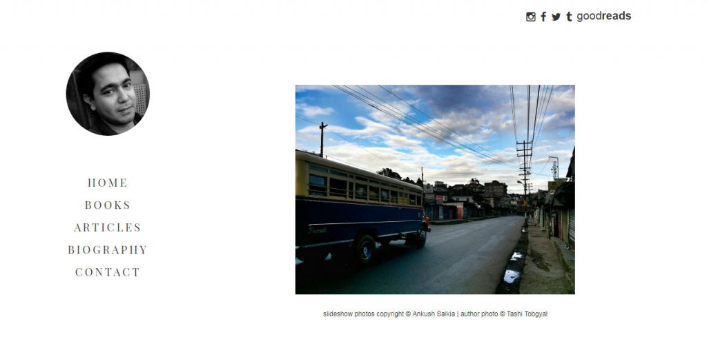
Ankush Saikia is a simple down to earth man and this reflects in his website. Ankush Saikia is constantly travelling and he clicks nice intriguing pictures from his mobile phone. The home page has a slideshow of some selected photographs. There are links to his articles published in various websites and his social profiles where he is very active.
He maintains a tumblr blog which he has linked with it mostly containing pictures of what he observes in his day to day life.His website is very personal and this allows his fans to have intimate relationship with him.
Black marks:
The copyright message below the slideshow can have a better font. The present font kind of looks ugly when compared with the look of rest of the site.
Jerry Pinto

What we like:
Jerry Pinto has written interesting books with equally interesting titles. The home page showcases all his books and you are definitely going to click on one of them and read the blurb of the book generating enough interest for his books to make you buy it. It does not boast of a great design but definitely has some good content.
Black mark:
There is nothing as such but we wish the website provided links to amazon, flipkart, etc. for buying and goodreads (for reading reviews) below every book blurb so that a visitor can find them easily.
Vikram Chandra

What we like:
You see his website at the top of list when you search for “Indian author website” due to some good SEO. It has a colourful yet demure homepage and it showcases a slideshow of his books linking to pages with descriptive reviews of the books.
Black Mark:
There is no easily locatable link to his social profiles.
Tabish Khair

What we like:
The first thing that comes into our mind when we visit his website is “Wow!”. I can repeat that. His website is a true insight of his books.
Black mark:
None.
Vikas Swarup

What we like:
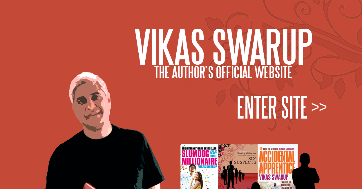
You meet a colourful flash screen when you enter his site. This diplomat who got into fame after his first Q & A which was adapted into an Indie film Slumdog Millionaire went on to become a box office hit. Within minutes you find yourself reading all his interviews and reviews.
Black mark:
None that we could find
Devdutt Patnaik

What we like:
Whether you are a Devdutt Patnaik fan or not, you will like his website as it is filled with interesting articles complimented with illustrations by Devdutt Patnaik. The site is full of content with articles, blogs and videos.
Black mark:
Actually, a red mark. The dropdown menu at the top has a red background which should be changed immediately.
Update: The layout has been changed now with a bluish grey theme
Chetan Bhagat

What we like:
Chetan Bhagat might not be very popular among his critics but we have to admit that he proved that writing as a career can be possible in India. Of course, his books are not regarded very high in literary circles but he made ordinary Indians who would not have read a book in their whole lives read his books. A lot of the credit goes to the marketing he does for his books. He also has a website showcasing his works and books that were adapted into movies. He has kept his website very simple with primarily focusing on his latest book and you will like it.
Black mark:
His tech team should work on “Other Works” page which looks disorganized. Also, the background of the sub-frame should be white and not grey. It is a turn-off when you move away from home page.
Amitav Ghosh

What we like:
At first look, it appears as a pretty ordinary layout but on a closer look, you will notice that the background has the same theme as his upcoming book “flood of fire”.
Black mark:
We hope that the layout will soon be changed for promoting his next book.
Update: The layout has been changed in line with his latest book The Great Derangement
Chitra Banerjee Divakurni

What we like:
A simple website. A blog post had just been published while we were still analyzing her website. An honest post which ends with the recipe what she had cooked today. There is a variety of topics that has been covered in her blog which brings her readers understand her better and develop a personal relationship.
Black marks:
We suggest a change of font in the dropdown menus.
We welcome your comments at letters@friedeye.com
About the author
Trying to fit into the world. In between I destress by trying to work for Fried Eye.


